Monday, 8 May 2017

Evaluation Question 4.

Who would be the audience of your media product?


https://www.slideshare.net/alexandrahannah1/evaluation-question-4-76050961

Evaluation Question 5.


How did you attract/ address your audience?

For the front cover of my magazine I placed it onto Facebook to find out what the audience think about my music magazine where 98% of the people looking at my magazine stated that "it was a professional looking magazine that they would pick up."


 As well as that, they stated that "the colour scheme is appropriate for the magazine and it looked sophisticated."


They also stated that "the headlines show clear indications to what is in the magazine."

As well as this "you can clearly see what the feature of the magazine is.

One dislike my peers have of the magazine "There are a lack of colours within the magazine except from when there are text."

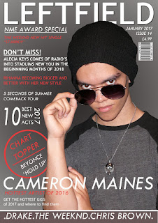
The bands that are a part of my magazine are: Drake, The Weeknd, Chris Brown... Where each of these names being in white and a little bigger than some headlines. However, smaller than the main features. As well as, the main image being a professional image that follows the conventions from my style models.

Throughout the process of creating my music magazine I made sure to attract my audience by using placement on my pictures and the type of topics my magazine was about. I asked people that I knew like classmate and friends of the different things that would attract them if they were to read my magazine, taking on their comments I created my final product by improving my work to attract my audience. This also helped me to create my magazine to look more professional because of the different style models I had used and the feedback that I had looked upon to help me to create the best work I could. 
For my front cover, I made sure that my magazine displayed common names of people within the R&B genre of music, making sure to pick out male artists to suit the male artist I used for a model on the front cover. However, for the smaller headlines I made sure to include females, suiting my target audience; as my magazine is not just a male dominated magazine. I made sure to use different font sizes and colors that would like to the overall house style of my magazine to ensure that some headlines attracted the audience more than others. 
I made sure to include only 4 different colors so my magazine did not have too many colors but also had a clear house-style. Making sure the black gradient pages and white writing were consistent; whilst there was a red colour used for featured things and to draw more attention to a certain part of t page and to also break up the different text. 

Evaluation Question 6.

What have you learnt about technologies from the process of constructing this product?

Evaluation Question 7.

Looking back at your preliminary task, what do you feel you have learnt in progression from it to the full product?


Throughout the process of creating my music magazine 'Leftfield' there is some clear differences between this and my preliminary task. It clearly shows the progress I have made throughout my pictures, magazine layout and time management.


When I begun my preliminary task, I didn't know much about positioning on a front cover, how to draw the audience in and what is suitable for my target audience. For this i used style models of other school magazines. However, I struggled to create a suitable front cover from the style models I had found as I struggled to pick out specific conventions; this was mostly due to not spending much time looking at the different style models and not picking out common conventions and creating ideas with the time I had. However, for the music magazine I spent more time focusing on the convention of my style models that suited my audience; as well as different style that contrasted the common conventions, allowing me to find different ways of presenting my work throughout my front cover, contents page and double page spread. I choses specific style models which helped me to achieve a specific style throughout my magazine and to ensure I found it easier to create a magazine that suited more conventions of a professional magazine. For this I spent more time researching into different areas; overall benefiting my work to make it more professional looking and to make sure it looked unrushed and worked upon.

As well as this, I mad sure I planned my work more and put more time management into it. I planned what date I wanted to finish each task and what I wanted to complete in each lesson and at home. This meant that I could spent time on one specific task as I knew I would have time to complete the others.

The biggest difference was my photographs, I had not planned out my pictures, location and costume of my model as much as I had for my music magazine. As well as this, I didn't spend much time getting varied amount of pictures to suit my magazine. I spent time thinking about what kind of stule I wanted and what I would have liked to portray throughout the school magazine for the preliminary task. However, for the music magazine I spent more time checking the location, lighting and other things that would contribute to making my picture look more professional. I took draft pictures to ensure I w able to create a suitable page with this, making a draft and making sure I planned enough time to take the pictures when it came to do so.

Overall my work is more planned out than the preliminary task. Making sure time management was key for my work and making sure it wasn't rushed.

Sunday, 7 May 2017

House style for my music magazine

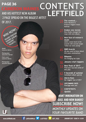
For my magazine I chose a house style using the colours black, white, red and dark grey/brown. I used only 4 colours as common convention throughout the style models I have looked at only use 2-4 colours throughout their house style.


I used the whites to show the 'best' articles in my magazine as this is the colour I used for my font. As well as this, white is a common colour that can stand out as well as can show small writing to not be very important like in the top right hand corner where it states "January 2017", "Issue 14" and "£4.99" This also shows to be less important as the font size is small and in 'regular' rather than 'bold'

As well as this I made sure that my footer was slightly a different colour so it was more visible to my target audience and that it was a different part to the magazine, as this states artist names and what type of artist will take be the genre of my magazine.

The red throughout my magazine allows me to break up text and headlines as well as making certain text stand out. I used this throughout the section stating "Chart topper" and the wrote underneath "Beyonce..." as this was less important than "Chart topper"

I also made sure to add the logo 'LF' in the bottom left hand corner of each page to make sure that it is visibly part of my magazine. As well as making sure to add the website next to that on the double page spread
Using Guidelines In My Work


I used guidelines to help centre and correct my work so that everything is in equal spacing and also shows how much I would need to write onto my work. This also helps to make sure that my work is no cut off when it has been printed.

Saturday, 6 May 2017

Improving My Front Cover.

After completing the first draft of my music magazine front cover I found that I have placed my headlines and shapes in the wrong place. Therefore, it had took up to much room in particular places and left spaces in others. As well as this a lot of my text was not visibly standing out more than others like my double page spread title and there is a lot of room next the 'chart topper circle'

On the improved front cover I moved things to a placement on the double page spread which would have meant I could include more headlines on the front cover, as well as creating more importance to certain headlines.

As well as this I added a footer allowing me to have more room to add artists names which would attract more readers. As well as, making my double page spread title stand out and placing it across the page.

I moved the date, issue, price and barcode to behind the model so that it would have more room for the headlines.