Showing posts with label Music Magazine. Show all posts

Sunday, 7 May 2017

House style for my music magazine

For my magazine I chose a house style using the colours black, white, red and dark grey/brown. I used only 4 colours as common convention throughout the style models I have looked at only use 2-4 colours throughout their house style.


I used the whites to show the 'best' articles in my magazine as this is the colour I used for my font. As well as this, white is a common colour that can stand out as well as can show small writing to not be very important like in the top right hand corner where it states "January 2017", "Issue 14" and "£4.99" This also shows to be less important as the font size is small and in 'regular' rather than 'bold'

As well as this I made sure that my footer was slightly a different colour so it was more visible to my target audience and that it was a different part to the magazine, as this states artist names and what type of artist will take be the genre of my magazine.

The red throughout my magazine allows me to break up text and headlines as well as making certain text stand out. I used this throughout the section stating "Chart topper" and the wrote underneath "Beyonce..." as this was less important than "Chart topper"

I also made sure to add the logo 'LF' in the bottom left hand corner of each page to make sure that it is visibly part of my magazine. As well as making sure to add the website next to that on the double page spread

Using Guidelines In My Work


I used guidelines to help centre and correct my work so that everything is in equal spacing and also shows how much I would need to write onto my work. This also helps to make sure that my work is no cut off when it has been printed.

Saturday, 6 May 2017

Improving My Front Cover.

After completing the first draft of my music magazine front cover I found that I have placed my headlines and shapes in the wrong place. Therefore, it had took up to much room in particular places and left spaces in others. As well as this a lot of my text was not visibly standing out more than others like my double page spread title and there is a lot of room next the 'chart topper circle'

On the improved front cover I moved things to a placement on the double page spread which would have meant I could include more headlines on the front cover, as well as creating more importance to certain headlines.

As well as this I added a footer allowing me to have more room to add artists names which would attract more readers. As well as, making my double page spread title stand out and placing it across the page.

I moved the date, issue, price and barcode to behind the model so that it would have more room for the headlines.

Friday, 5 May 2017

Improving My Contents Page.


I made a clear improvement from my previous contents page to my finished contents page.

I had chosen to complete my original contents page like this; as I had seen this throughout my style models for billboard.

However, after receiving feedback from classmates. I had found that my contents page had many spaces and also was to cluttered within the contents bar. As well as this, the brown bar didn't show to link to the front cover, as there was not a footer on the front cover at first.

Therefore, I changed my contents page by finding a new style model to follow that still suited the same target audience that I was going for.

I used another contents page as a style model. However this one had a different layout. Therefore, I followed the basic structure of this contents page to create a more professional looking contents page.


I followed this structure by placing my model to the left hand side of the contents page and having my text to the right. As well as this, I placed the more important onto the left hand side like they have in this contents page.

I also used the convention from this contents page of having the 'V' in the background to represent what magazine it is. However, I used 'LF' as this is the initials for my magazine.

Saturday, 29 April 2017

Creating My Front Cover


I decided to create my front cover with a gradient of black to make sure that there wasn't a block colour which would allow my magazine show the different articles it has to produce as it has a gradient, suggesting it is covering all topics.

Making sure the darker colour is centred towards the middle to make it draw attention to the middle of the page. Which will also show the audience where the main articles and what is more important (my double page spread).


Next I added my title to my magazine and my model which was located slightly to the right to show the audience the other articles that the magazine is displaying. As well as this the model is slightly moved to show the left side of him.

I put the model slightly covering the title 'LeftField' as this is a common convention for R&B and pop magazines. Therefore, I have followed these conventions to show that my model is the main feature of my magazine.


I have added an Issue number, date and price to the right hand side of my model. I have placed it in this location as this is a part of the magazine that is less important. Therefore, it doesn't need to be on the main part of the magazine's front cover (to the left of the model). I have decided to release my magazine in January 2017. However, this magazine is in the issue 14 which would not be the amount of issues that the magazine would have been at the month of 14, as a common convention of music magazine's is releasing a new magazine each month. I added a barcode underneath this.


I added a footer to my magazine, displaying names of R&B artists that would be popular throughout magazines. I decided to do this in a brown colour as this is an accent colour for my magazine and will be seen on the contents page. As well as this, I chose to write the artists names in white as they are not as important as some of the other articles in my magazine. I separated this with a white line to show that it is different to the other parts of my magazine.


Next I added the models name of my main feature on the very front of my magazine to make it stand out, with a little strap line to show what the article is about stating 'Hottest artist of 2016'


I added more features of my magazine making sure to rotate the colours of each between red and white changing what each headline is different.

As well as this, my magazine is similar to the NME magazine. Therefore, I put a line underneath my title to show that it is a special after the latest award show.

Wednesday, 19 April 2017

Creating My Contents Page.


I carried my house style to my contents page to show the link between my magazine, as I would like it to be visibly the same as the front cover. This included adding the brown footer, the gradient black background and the white line between the footer and the gradient.

I also chose to add a faded 'LF' in the background to show it is the 'LeftField' magazine without seeing that title on the page. This will be carried on throughout my double page spread and would be inside each page of my magazine to show that it is the 'LeftField' magazine.


Next I chose to add 'Contents' and 'LeftField' to show that this is the contents page. However, I chose to put 'Content' bigger than 'LeftField' as readers would have already seen the front cover. Therefore, they will know that it is the 'LeftField' magazine. As well as this, the contents page tends to stand out and a lot of people are going to look at it. Therefore, I made sure that this was still a good size to catch the reader as they are skim reading over the page.


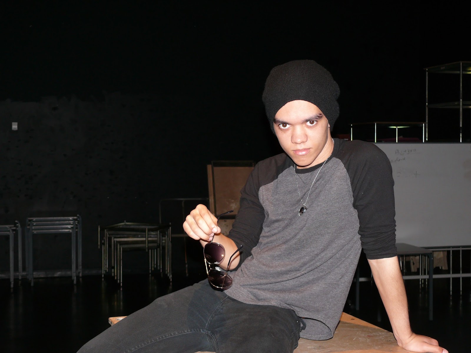
Next I added my model from my front cover to make sure that I had shown consistency and also to show that he is the main feature of this magazine. I added him slightly towards the left to give space for the contents of my magazine and allow all the contents to be placed together.


Next in the bottom right hand corner I added a space for people to read about subscribing to the magazine; as I would like the audience to have the choice of subscribing and that it is an offer for the magazine. As well as this I decided to add the rhetorical question "Want information on gigs and new bands?" in order to show the audience what is included in each magazine. Along with "Monthly updates on you favourite band" to tell the audience how often they would recieve a new magazine.

I also added a bigger headline for the double page spread; showing where this is located in the magazine and also what it is about, telling the audience "2 pages on the biggest artist of 2017" This stands out a lot more than the rest of the magazine, which shows that it is the biggest article throughout the magazine.


Next, to make sure that there was no empty room next to the picture I decided to place a description of each picture, to take up the room and give credit. This is in smaller writing and also is not bold as this is not important.


I also added on the right hand side of the model each headline of the magazine with a short headline in bold and a bigger writing. However, a little description was added underneath each headline to show what the article was about. I made sure this was all in white because each article has the same amount a of importance as the other articles. As well as this, I added the numbers in red as they would stand out more and show what article is on each page. This also carries on with my house style as red is a main colour throughout my magazine.

I also added in the bottom right hand corner 'contests' and 'quizes' these are in smaller writing as they are not as important.

Above my footer I added the logo for my magazine 'LF' to make it clearer that this is the 'LeftField' magazine. Although I have used the footer to show the platforms that my magazine can be seen on such as: Twitter, Facebook, Snapchat, as well as a web link. I also gave information about what issue and what date this magazine came out.


Saturday, 15 April 2017

Creating My Double Page Spread.


For my contents page I made sure to create my double page spread using the same gradient and the background of LF to show my house style of my magazine.

I have also included my logo and website to the bottom of the page to show the audience what magazine they are reading and also where to find more information about the magazine.


Next I added my model to the right of the double page spread to give enough room for my text and to allow my model to take up the whole of the right page.


I also added a smaller picture with a blurred background to the middle of my text to show the audience there is less to read but a lot about the artist. As well as that it shows what type of character he is and also it is a little more personal as the background is still in it.


I added a title to the page saying "LeftField exclusive with Cameron Maines and top journalist Lauren Evans" to make sure the audience could clearly see that this article is associated with the LeftField magazine and also states what the article is about and who the journalist is.


Then underneath that I quoted my model with a quote from the article.


Next I added a circle that contained the main features new album; which is what the article is about. Therefore, I have clearly shown what the newest album my artist has come out with to show the feature.


I added an A that covered 8 lines of my writing, this is a common convention for double page spread articles at the start of the article, to display the start. Therefore, I have done this.


I added a page number  and my article, writing about an interview with Cameron Maines with journalist Lauren Evans.


Thursday, 9 February 2017

Finding a title for my front cover.

In order to name my music magazine I used different style models to find out what type of title matches with each magazine and what genre my title will connote.

I chose 'Leftfield' as my name for my music magazine as field has cmany different connotations.

The word 'field' connotes festivals and music festivals, where music festivals have famous artists and the latest music. This suggesting that my music magaine is relative to todays music and also shows the top artists.


Thursday, 2 February 2017

Choosing A Title Font.

I decided to choose a selection of fonts for my front cover ranging from bold to very spaced out. The different fonts that I chose made it easier ask my audience which would suit my music magazine and looks clear, with all the fonts I chose having spacing between the letters that would make it easier to distinguish.


After I had asked for audience feedback I got a 95% response to use the Trebuchet MS. The common reason for this is that it is clear and shows what my magazine portrays.

Wednesday, 1 February 2017

Final Image For My Front Cover.


I chose to use this image for my front cover as Cameron is facing forward with his arms crossed to show his attitude. However, the use of pulling down his glasses below his eyes gives evidence that we are seeing the inside and what he’s really like. In a sense that he is taking down his guard.

As well as this, he is the image is also a mid- shot. Therefore, it suits the style of my magazine, as this is a common convention for music magazines.

Final Image For My Contents Page.


I chose this image for my contents page as it similar to the front cover. Therefore, the audience will see the similarity between the front cover image and the contents page. As well as this, the picture will be very different to the double page spread. Therefore, the audience will be seeing something completely different. Therefore, I am keeping the models position quite simple for the contents page.

He will be featured as the only image on the contents page. Therefore, I chose to complete a mid-shot where he now has his glasses off but he is still wearing the same outfit. He is still crossing his arms suggesting you will have to read the magazine to find out what he has to say to the journalist. As well as this he show attitude throughout his facial expressions to show that he has attitude within his songs. However, as he has took his glasses off it shows that he is going to tell you more. He is wearing the same clothes from the last picture as this shows the consistency of his style and what he likes to wear. As well as this, the simple outfit shows his style of what he enjoys to wear.

Tuesday, 31 January 2017

Final Images For My Double Page Spread.

I chose this as the final image for my music magazine as it suggests his attitude of laid back and shows some attitude. As well as this, the way he is positioned will allow me to place him over both pages of the double page spread, allowing them to be linked together easily by the audience.

The position shows that he is very open and has attitude showing that he could be very popular and comfortable with his career at the moment, this allows the audience to dennote that he is a popular artist at the current time.

I also would like to add a small image throughout my text. For this I am going to be using this image: