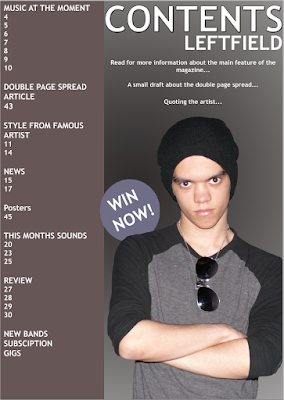

I made a clear improvement from my previous contents page to my finished contents page.
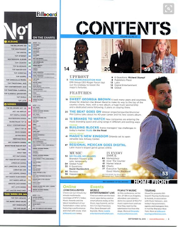
 I had chosen to complete my original contents page like this; as I had seen this throughout my style models for billboard.
However, after receiving feedback from classmates. I had found that my contents page had many spaces and also was to cluttered within the contents bar. As well as this, the brown bar didn't show to link to the front cover, as there was not a footer on the front cover at first.
Therefore, I changed my contents page by finding a new style model to follow that still suited the same target audience that I was going for.
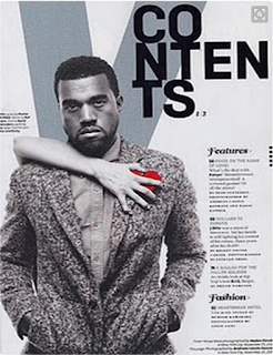
I used another contents page as a style model. However this one had a different layout. Therefore, I followed the basic structure of this contents page to create a more professional looking contents page.

I followed this structure by placing my model to the left hand side of the contents page and having my text to the right. As well as this, I placed the more important onto the left hand side like they have in this contents page.
I also used the convention from this contents page of having the 'V' in the background to represent what magazine it is. However, I used 'LF' as this is the initials for my magazine.
No comments:
Post a Comment