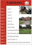
I can improve my front cover and contents page by making my magazine look more professional and look more like a school magazine by getting a varied pictures in different locations. Therefore, I would be able to use a picture that focuses more on a school environment. I could also include different pictures in my contents page to make it more varied and show different aspects the school offers.
The image I have used do not directly show the background story of the school of a warm and welcoming school.
Overall, my final magazine is not focusing on a school magazine. Therefore, if I was to do this again I would change the image or background of the image.
Friday, 11 November 2016
Thursday, 10 November 2016
Final Front Cover
My final front cover for my music magazine shows headlines that would be interesting for the parents of the students that attend the school; as well as students who would like to go to that school.
My Final Contents Page.
My final contents page uses the house style of red, black and yellow; which is the same as my front cover. Therefore, my contents page and front cover now look linked.
I also included my school logo and details about the school as this is important for the school magazine to display.
Lastly, I included a picture similar to my front cover to display the similarity.
Wednesday, 9 November 2016
Making my contents page.
I have created a template for my contents page on how I would like to lay it out and also how I would like the finishing contents page to look like. I have created this whilst using block coloured boxes to show where i would like to place my images and text.
I have used the house style of red, yellow and black to keep my magazine simple and to make it link to the front page.
Style model for my contents page.
I have chosen these style models as the contents pages are not cluttered with images and writing and clearly link to schools. Therefore, I would like to use some of the features in my magazine.
Finishing My front cover.
My finished front cover has consistent colours that display that my magazine links together. I will use these colours on my contents page as well. I also made this look more like a school magazine as I added a school website and logo to make it more authentic.
On the other hand, my magazine is very plain; also you cannot easily tell that it is developed for a school magazine from a distance therefore I will need to develop this.
Tuesday, 1 November 2016
Adding a masthead
I added a lilac- pink background. I applied a plane background to give my focus onto my image and my text.
Next I applied my masthead 'Inside Haul's News' I applied this to the top of my page. This makes it very visible and attracts my target audience.I also applied a school logo; allowing my magazine to be more recognisable to previous readers and also allows me to use the free space so my magazine doesn't look to empty.
Subscribe to:
Posts (Atom)